CONTEXT
Light pollution, the kind of pollution that we never really talk about.
—
Light pollution is the excessive and inefficient use of artificial outdoor lighting at night which leads to a brightening of the night sky. It is a global issue that has tremendously cost the economy, the environment, the ecosystem, and our sleep.
OBJECTIVE
To create two info posters about light pollution to bring awareness.
—
I wanted to create two separate posters about light pollution each with its own style, colors, and purpose. Both, however, would seek to marry information and art together.
DATA VISUALIZATION
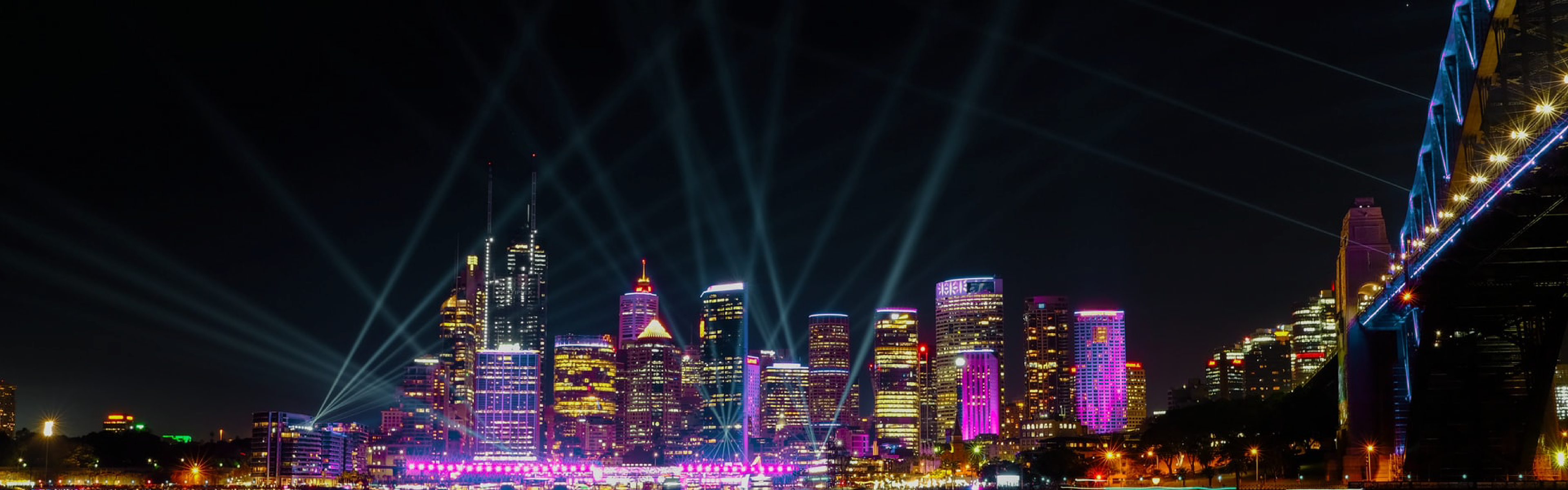
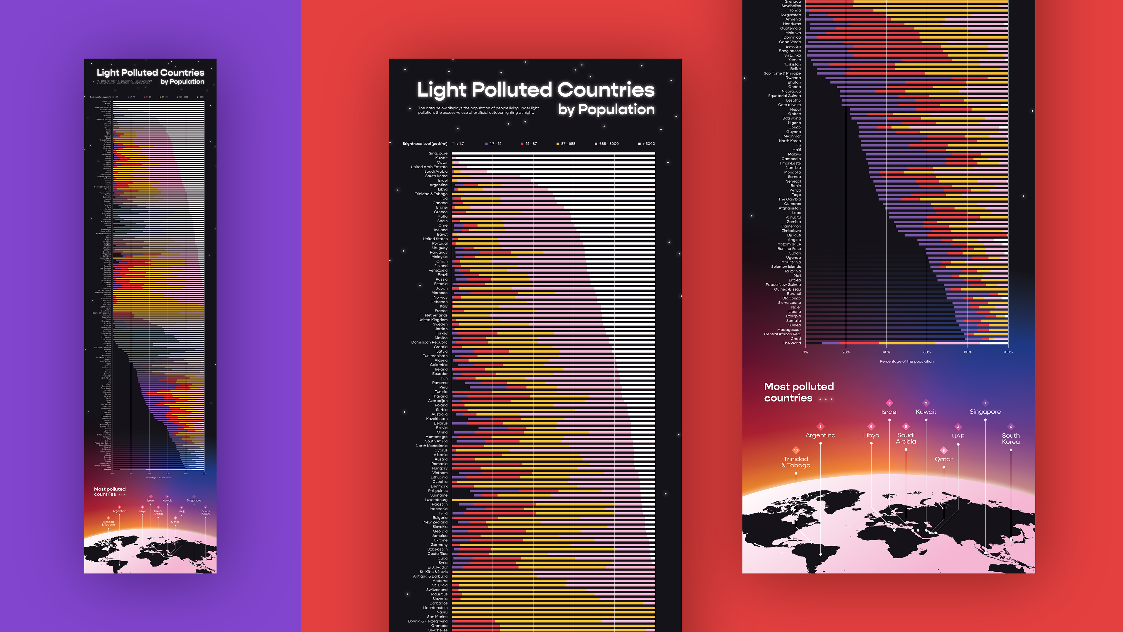
The first poster would transform raw data into a work of art.
—
I pulled numbers from "The New World Atlas of Artificial Night Sky Brightness" here published in Science Advances and decided to display them as stacked bars. This data visualization poster would show the amount of light pollution by population in a country.
STYLE + DATA VISUALIZATION
I decided on a high-tech and futuristic direction, drawing inspiration from bright, urban cities.

SOLUTION
The final 13x51" poster is striking and displays a wealth of information visually and concisely.
—
The stacked bar graph is the draw of the poster. The bars are purposefully arranging them from most to least light pollution for viewers to see the greater relationship and trends while the map and the glowing earth creates an environment.

INFOGRAPHIC
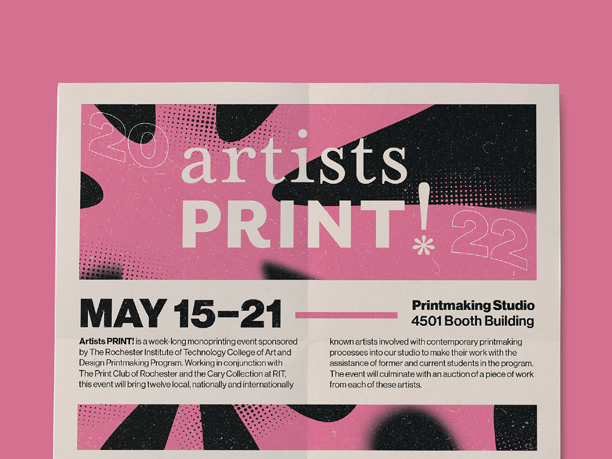
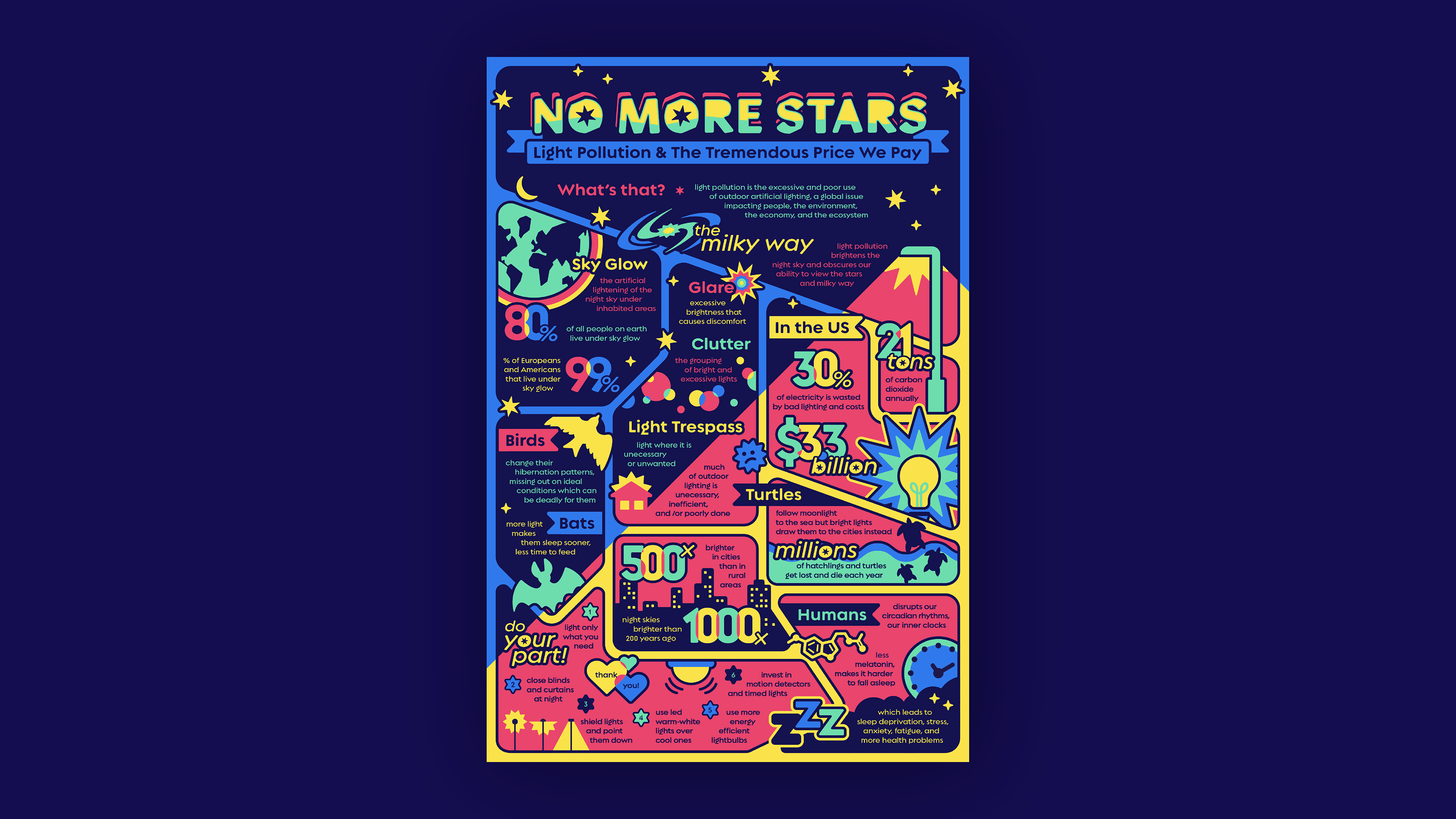
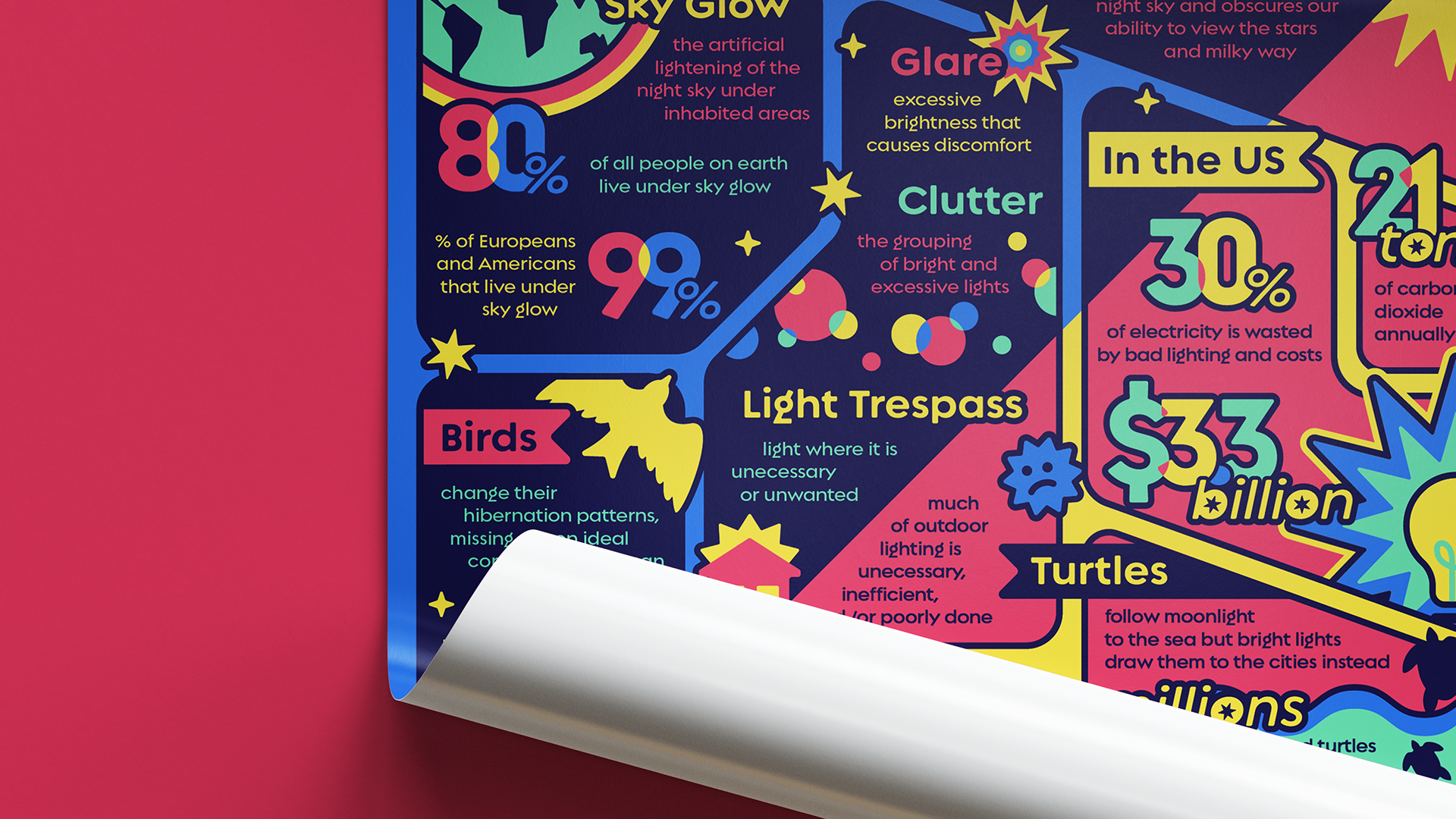
The second poster would be educational and fact-driven.
—
This 13x19" infographic would be aimed towards a middle school and high school audience, starting awareness and education about light pollution among the youth.
STYLE + INFOGRAPHIC
For a younger audience, I reached for a fun, retro, and friendly feel with a focus on illustrations.
SOLUTION
The final infographic is overwhelming with visuals and information, reflecting the dizzying lights of light pollution.
—
There is a fine balance of organized chaos in this piece moving from what light pollution is to its effects to the call to action. The colors and panel-breaking illustrations create a dynamic piece, capturing the attention and hearts of young viewers.
TAKEAWAYS
Different audiences, different posters.
—
Though the two pieces tackled the same subject, they are two completely separate pieces best suited for their individual purposes. Every aspect of a design should be carefully curated, and I learned to continually looking back at my research and original objective to not lose sight of what true success for this project looked like.