CONTEXT
Wegmans, a popular chain of grocery stores founded in New York.
—
With an "existing brand, a loyal customer base, and a strong culture," Wegmans is one of the most popular supermarket chains in the northeastern United States. They are known best for their range of foods that address a variety of dietary needs. Wegmans' popularity and products make it important for their ordering app to be intuitive and cater to the needs of their audience.
OBJECTIVE
To redesign and restructure the Wegmans mobile app to enhance or improve consumers' shopping experience.


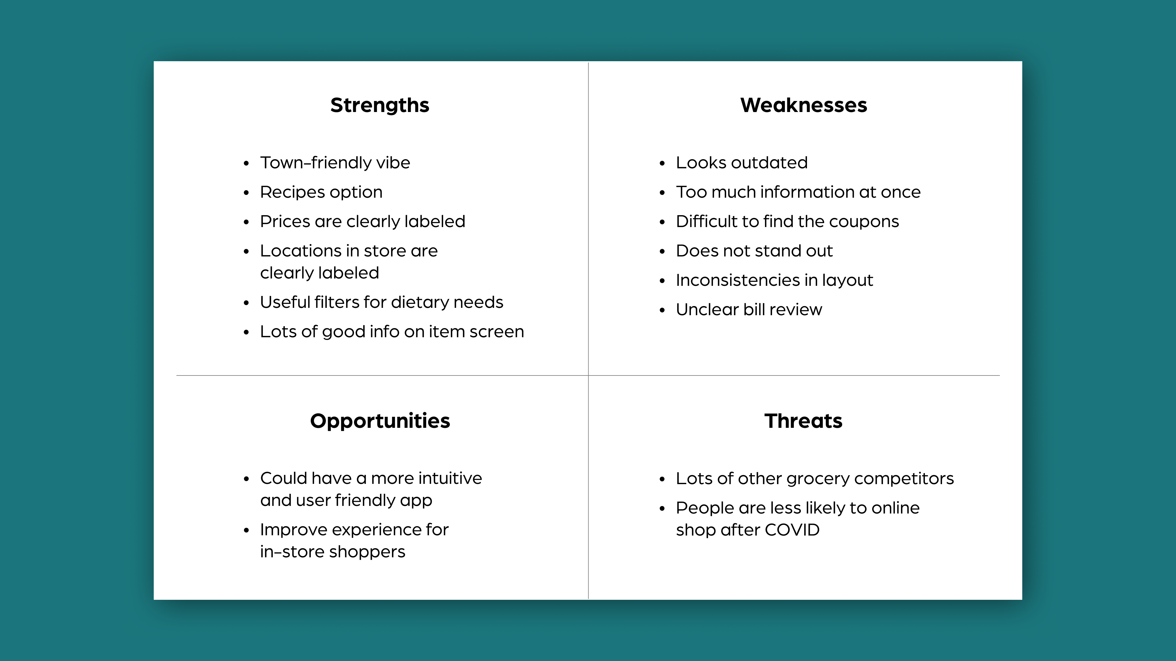
APP AUDIT + SWOT ANALYSIS
Their current app is clunky, inconsistent, cluttered, and feels outdated.
—
The app audit focused on different functions of the Wegmans app, primarily the start screen, homepage, shopping list, and organic section. I jotted down observations for each and also completed a SWOT analysis to determine strengths, weaknesses, opportunities, and threats to the app.
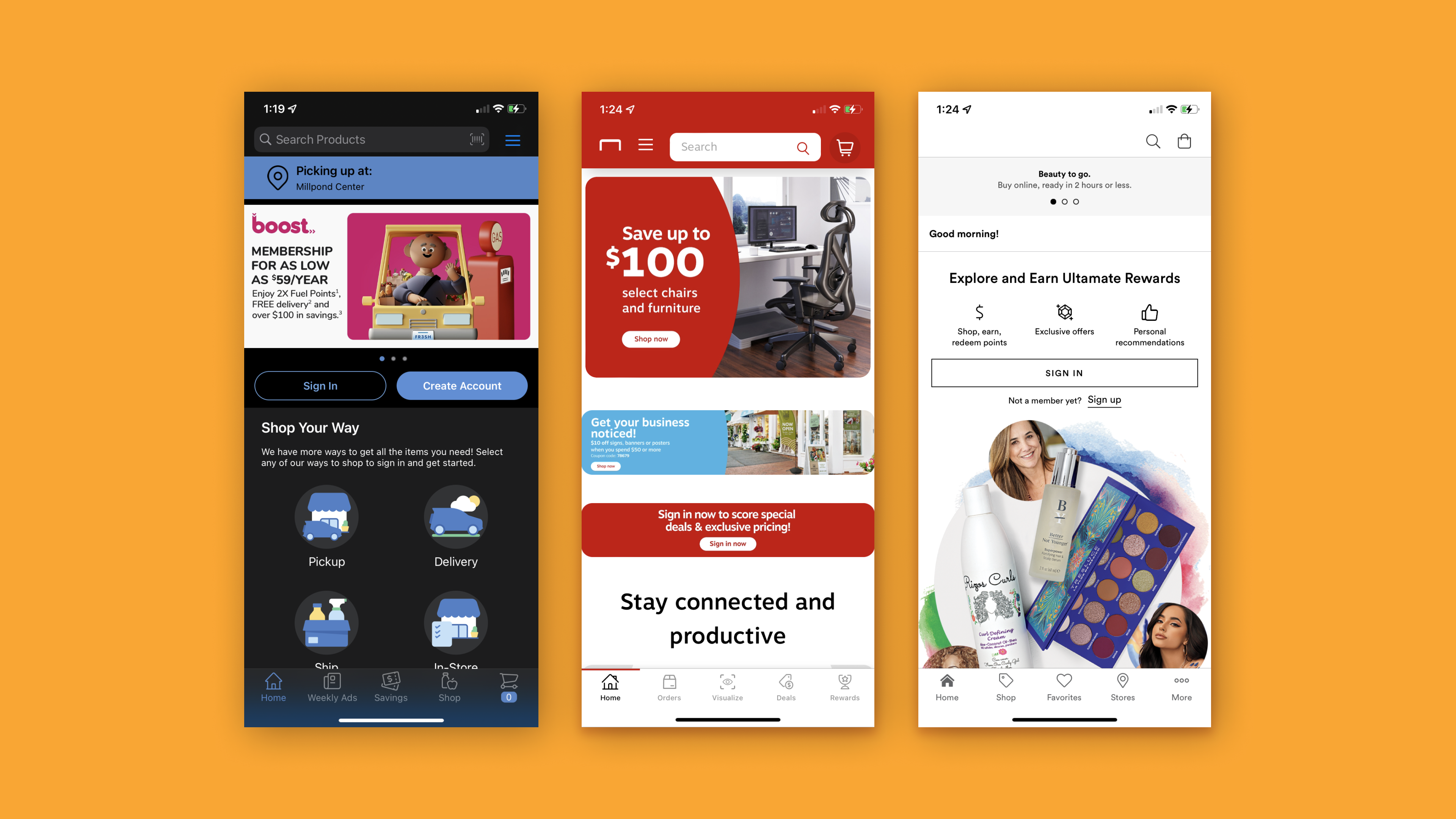
COMPETITIVE ANALYSIS + FIELD RESEARCH
I observed the structures of other store apps: Kroger, Staples, and Ulta Beauty.
—
Kroger, another chain grocery store is closest to Wegmans in service but I did not want to limit myself to only supermarkets. Looking at the likes of Staples and Ulta helped bring a relevant yet different perspective. Some areas I took a closer look at included their navigation bars, category layout, and store change screen.

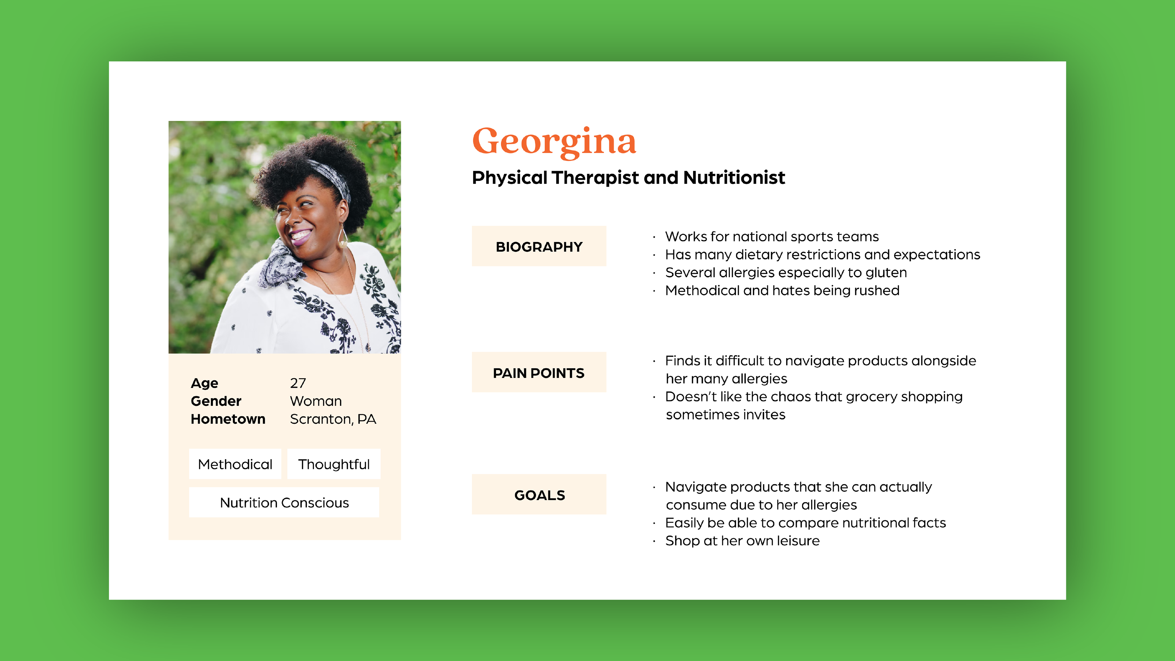
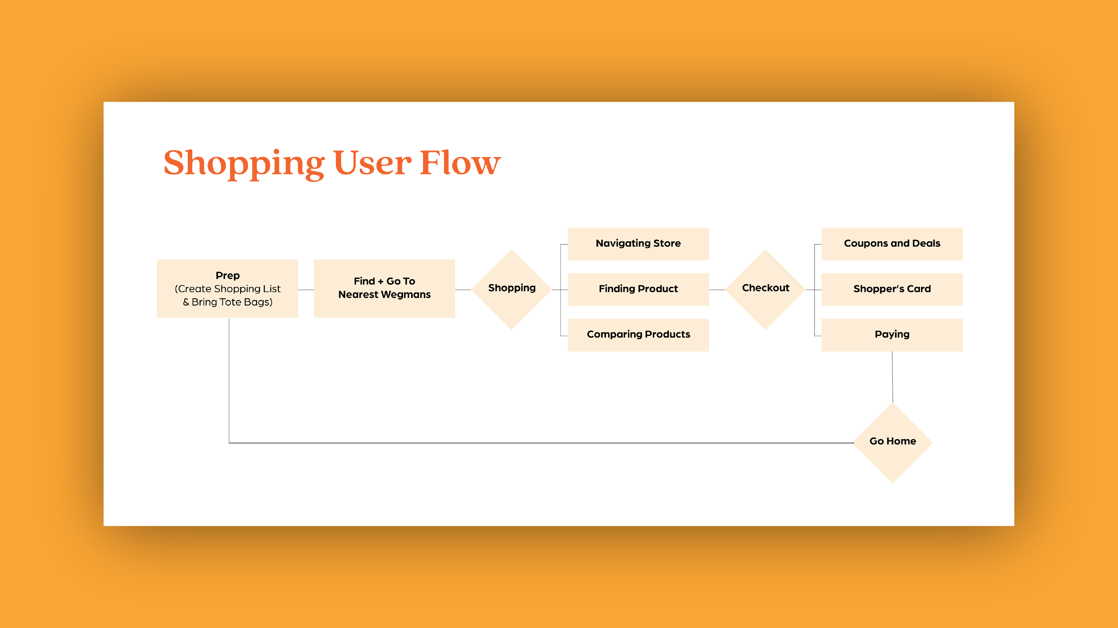
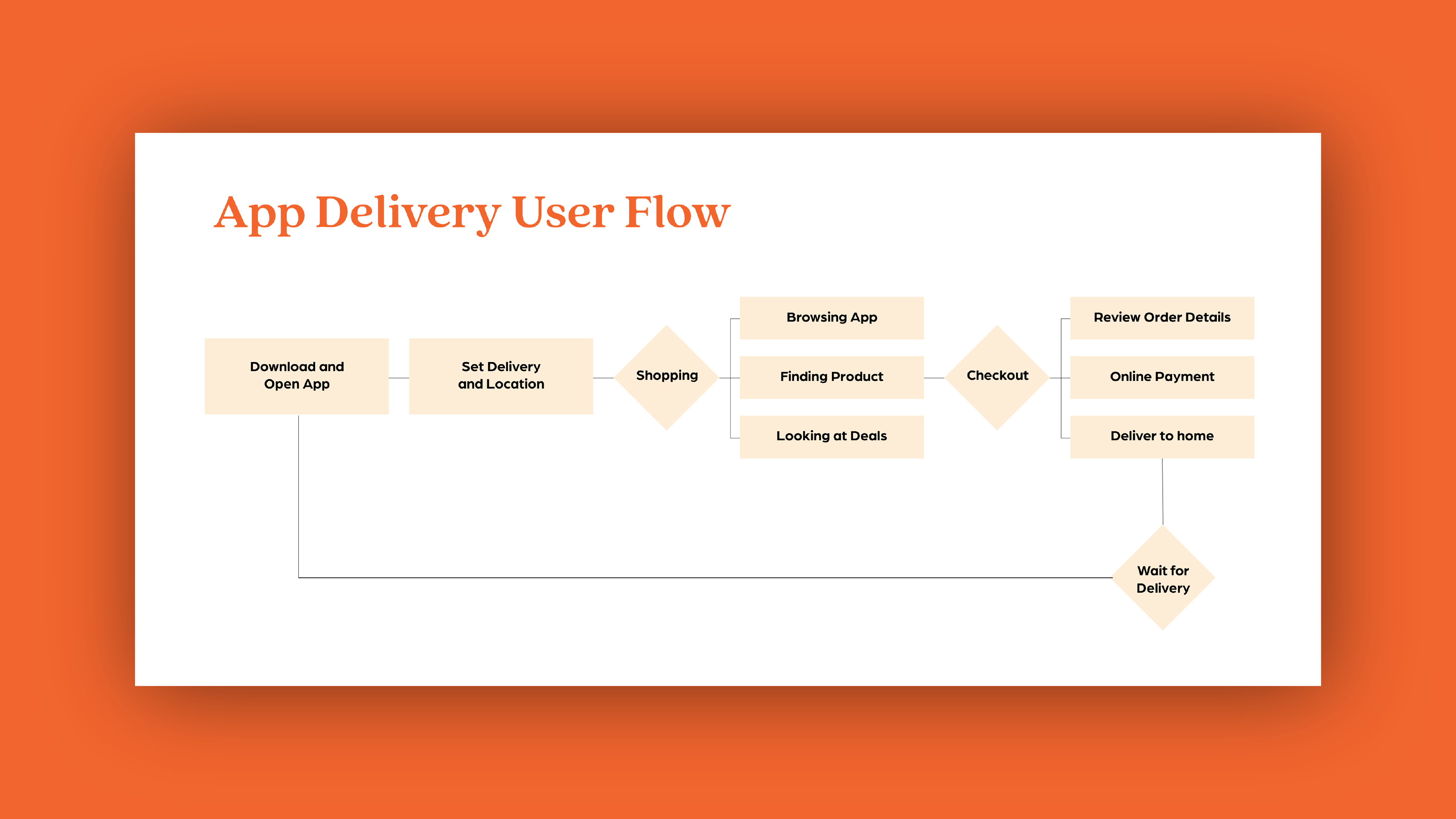
AUDIENCE + FIELD RESEARCH + USER FLOWS
I created personas and conducted field research to observe shopping behavior. User flows then helped visualize shopping and delivery journeys.

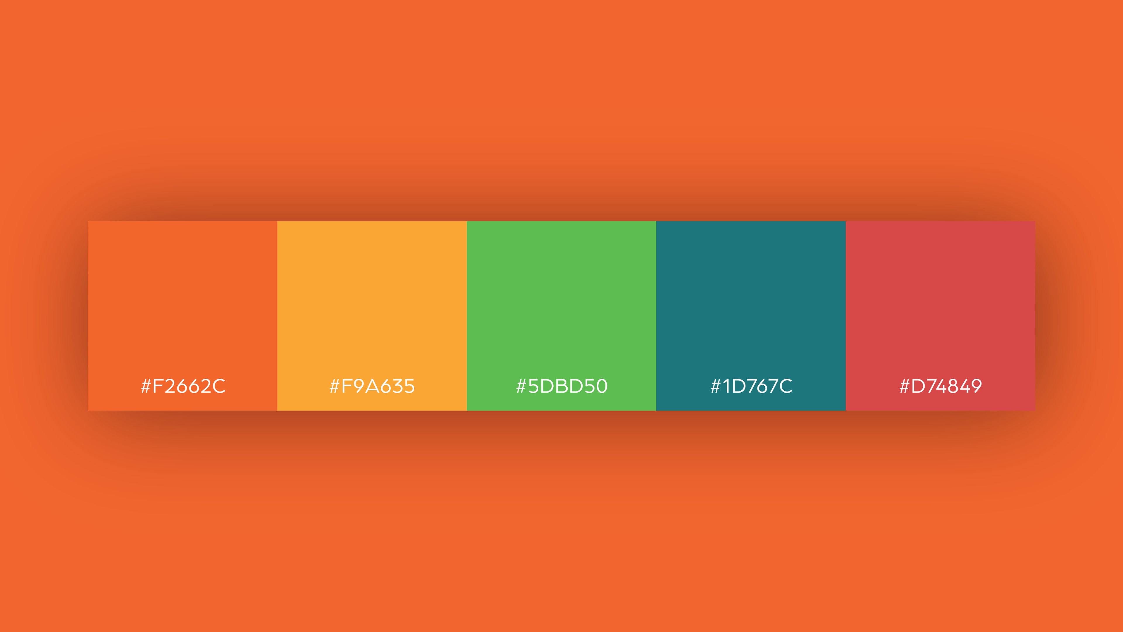
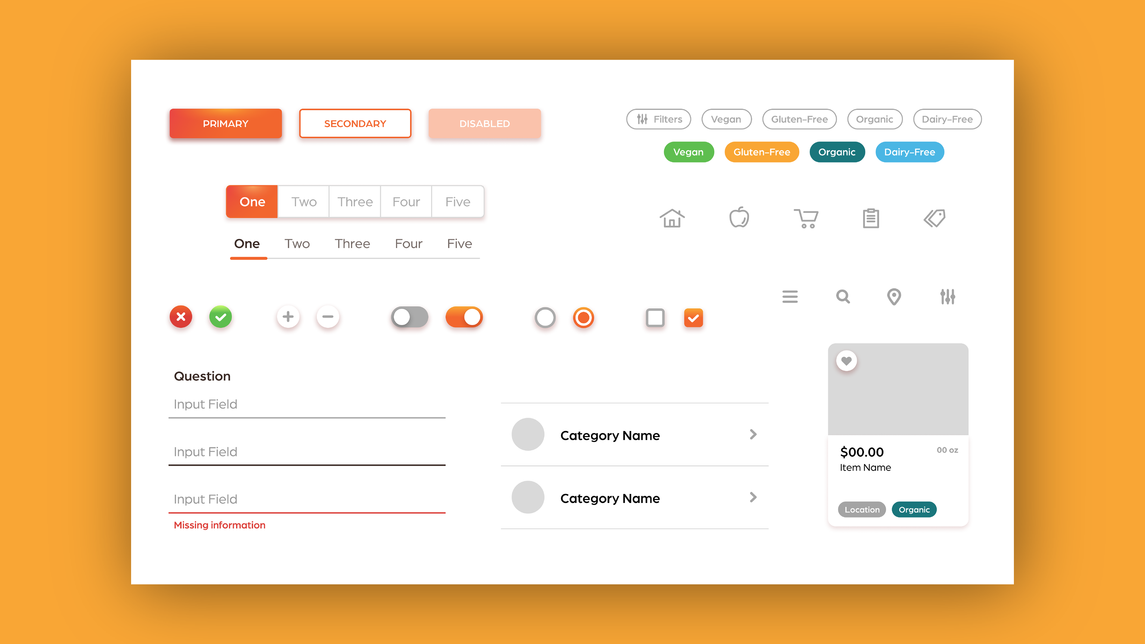
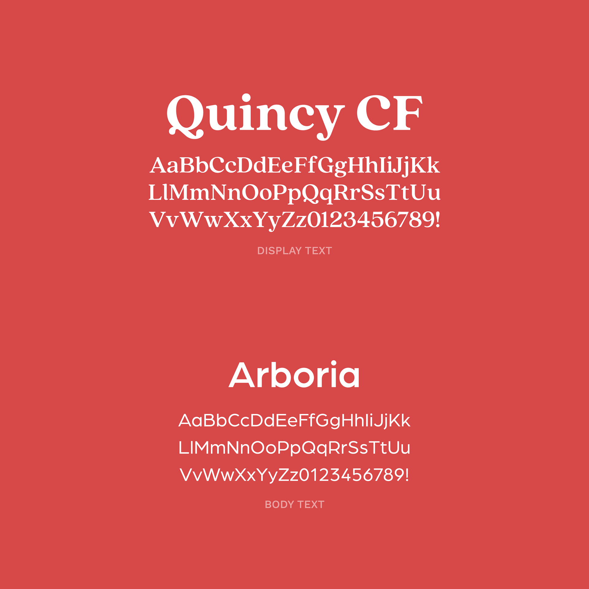
STYLE + UI KIT
I leaned into Wegmans' current branding with their colors and brushstroke graphics. The UI elements feel clean and use gradients for a bubbly look.

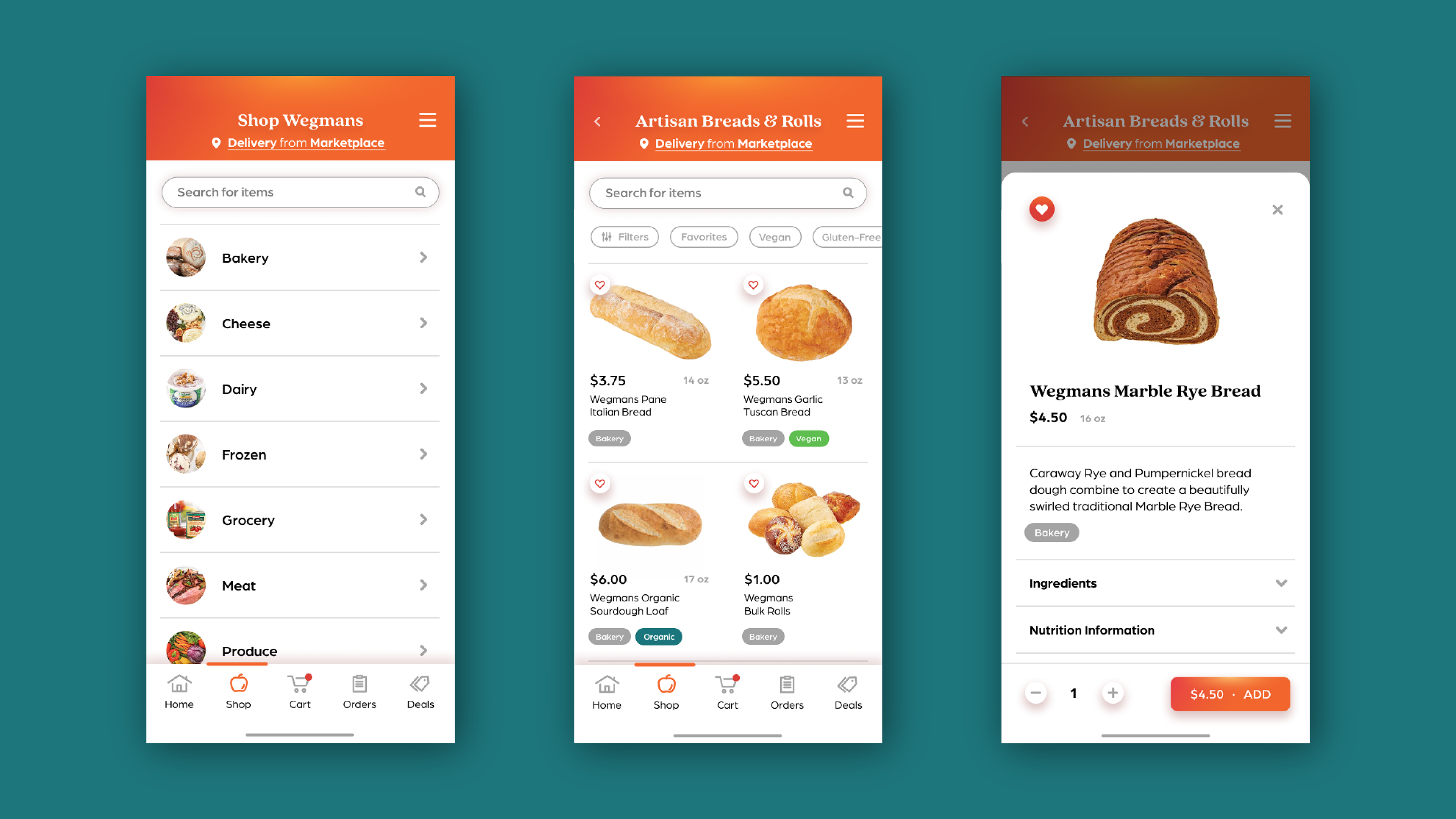
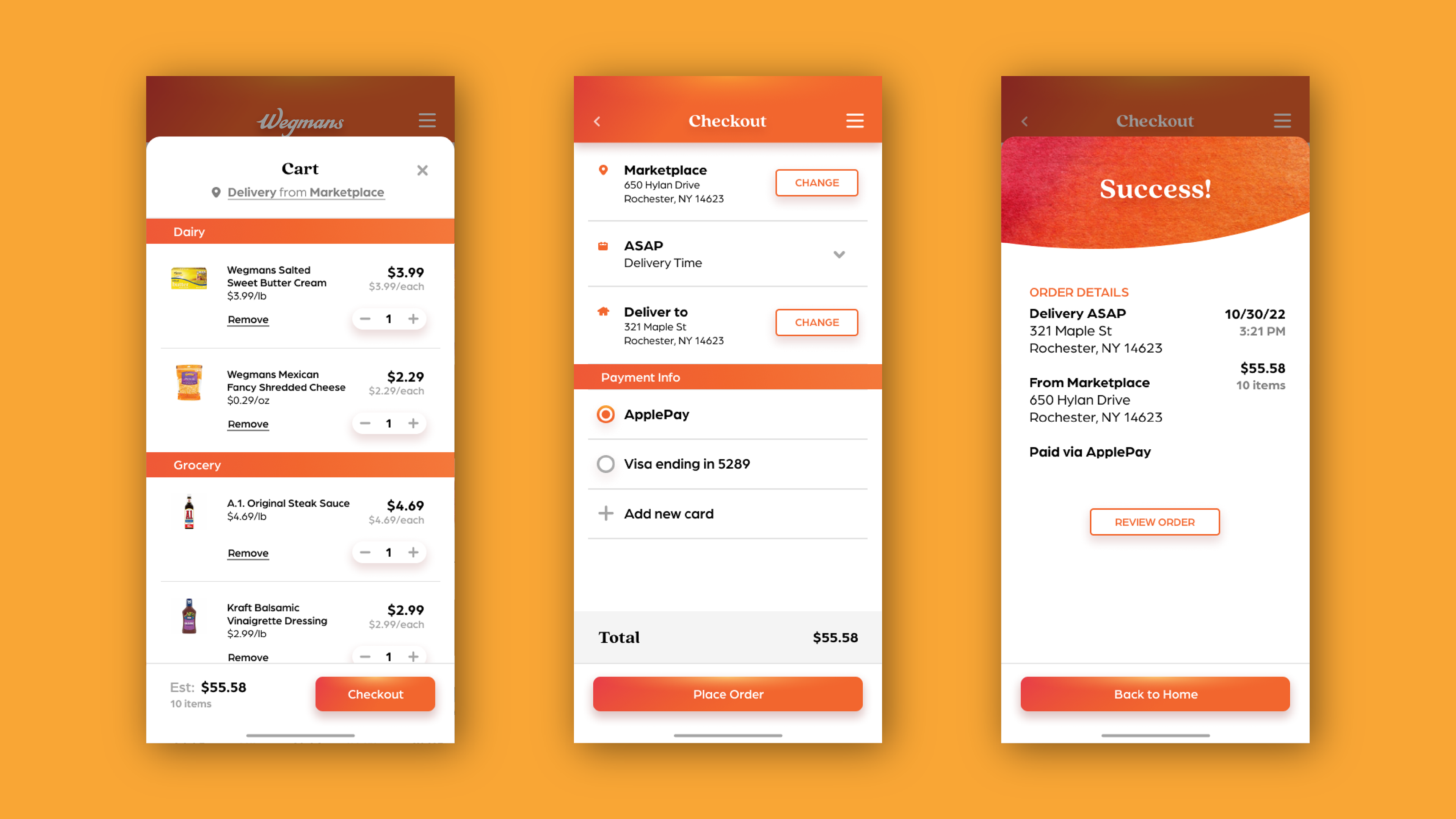
SOLUTION
The new app boasts a structure that emphasized hierarchy so items and tasks are easier to locate.
—
The app solution has a strong use of categories and typography to establish a clear and easy-to-follow hierarchy. When there is so much information to include, you have to be smart about how much to include for it to be concise and effective. The app takes notes on how people actually shop and flows from exploration to item research to payment.

TAKEAWAYS
Prototyping is cool!
—
I learned so much about how to prototype more user interactions in my UI/UX design work. I had a lot of fun figuring out how to make the radio buttons work and how each screen would transition into the next. It truly makes it feel more alive and real, helping visualize how the app would genuinely work and improve people's lives.